OVERVIEW
TOWN, a Chinese restaurant in the Midwest targets clientele that are between the ages of 30s and 60s. By honing in on this age range, TOWN recognizes the preferences and tastes of a mature demographic. It emphasizes a commitment to offering a dining experience that caters to individuals who appreciate values of authenticity, traditional flavors, and ambiance. The restaurant strives to provide more than just a meal; it aspires to curate an atmosphere that fosters conviviality and comfort. The commitment to authenticity extends beyond culinary offerings to the visual identity, ensuring that every element, from the logo to the interior design, reflects a genuine connection to Chinese traditions. Traditional flavors are not merely confined to the menu; they permeate the entire dining experience, creating a space where patrons can relish time-honored dishes amid an ambiance that evokes the rich tapestry of Chinese culture.
DESIGN CHOICES
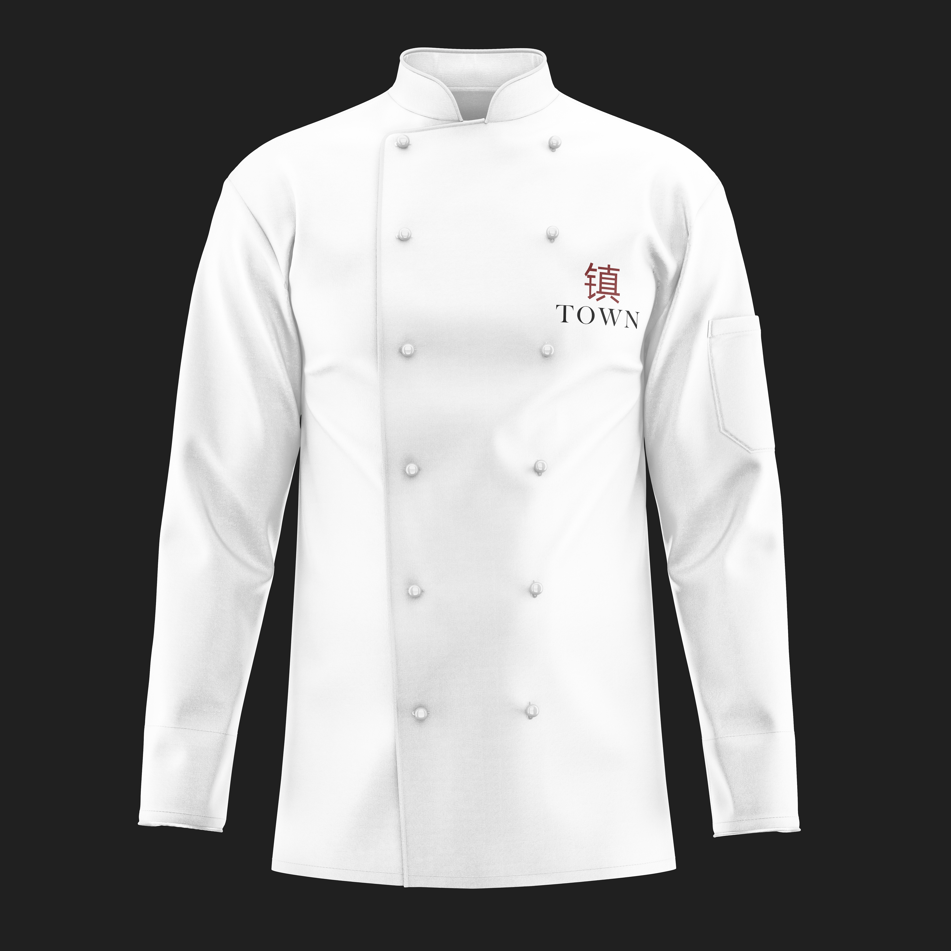
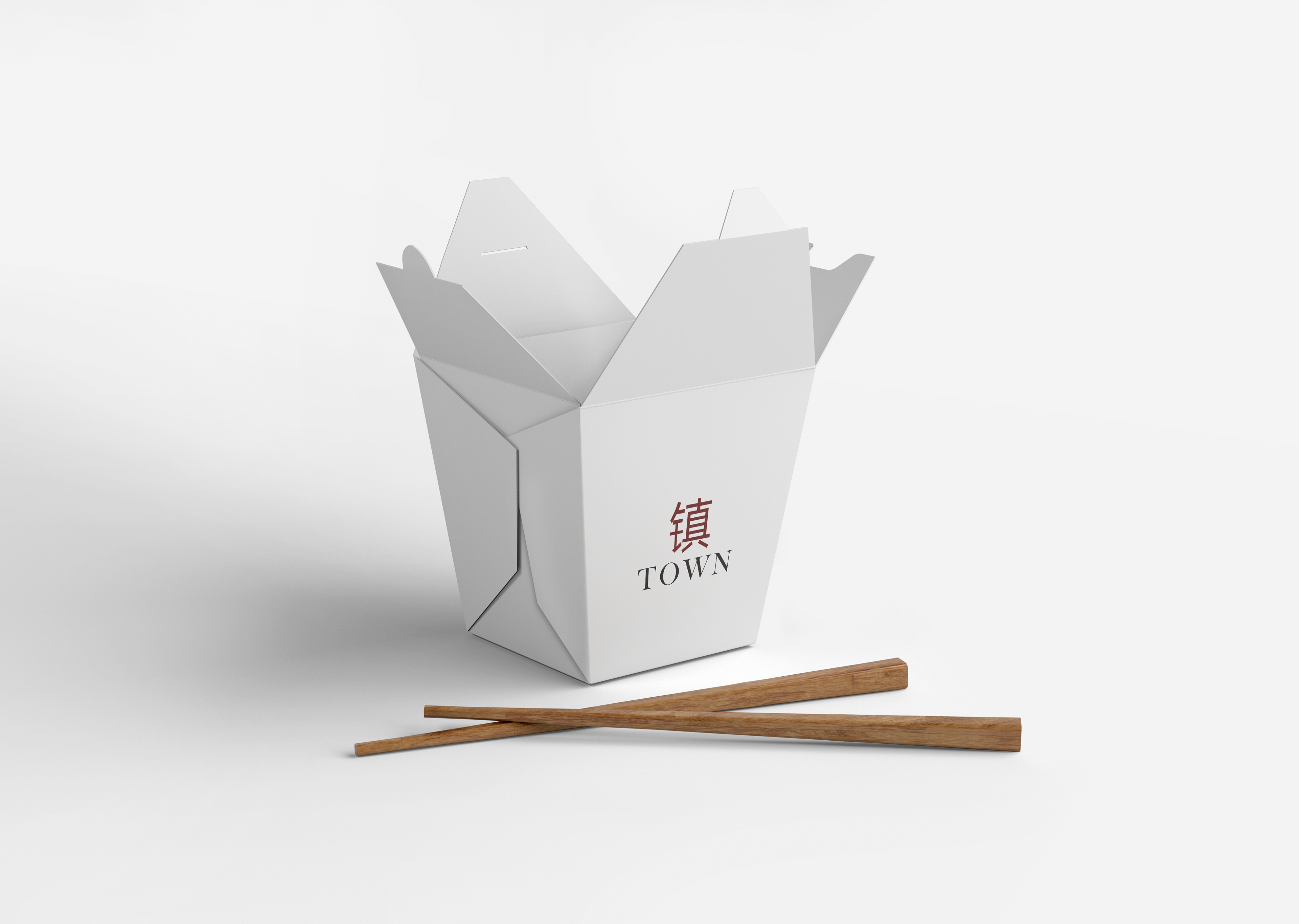
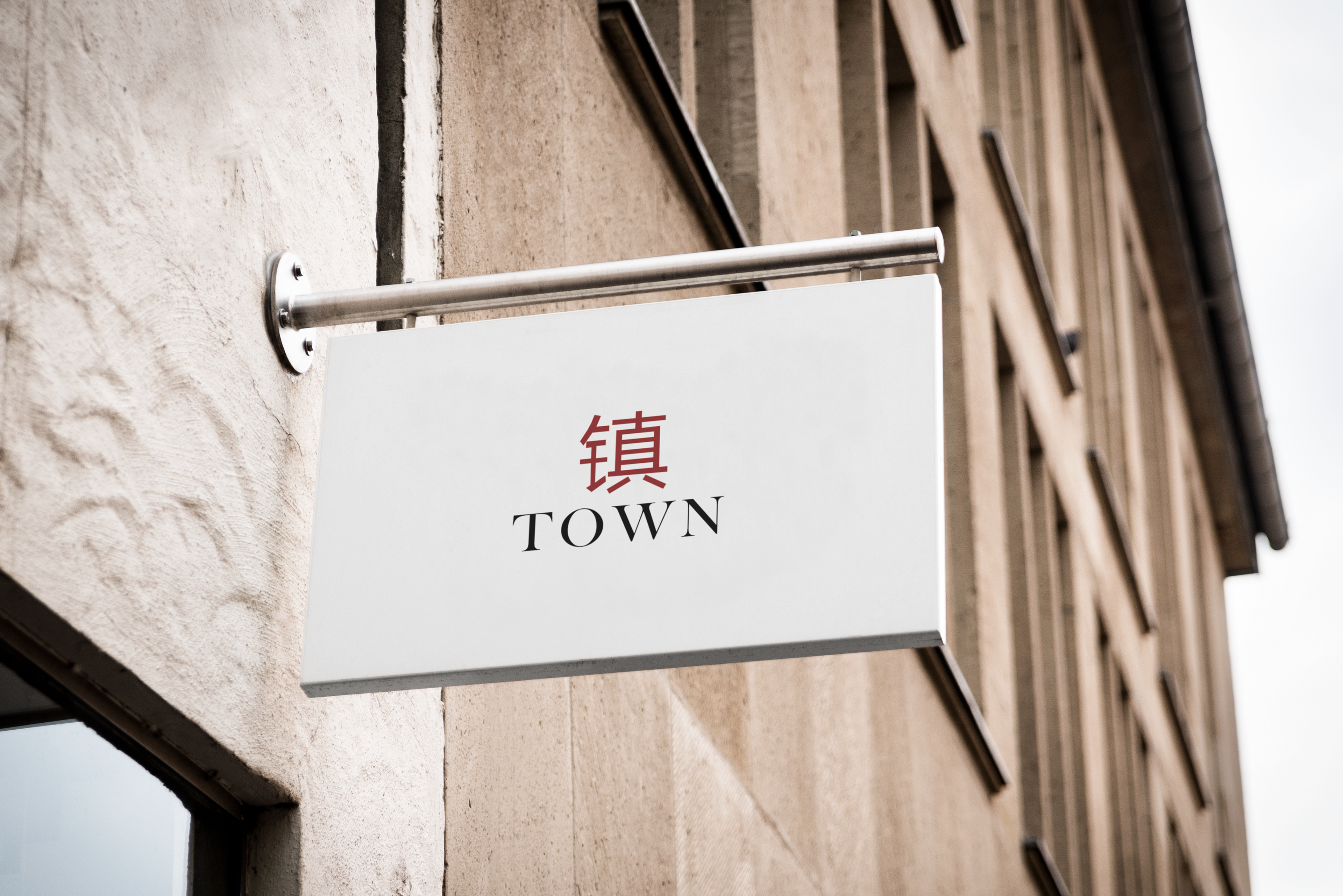
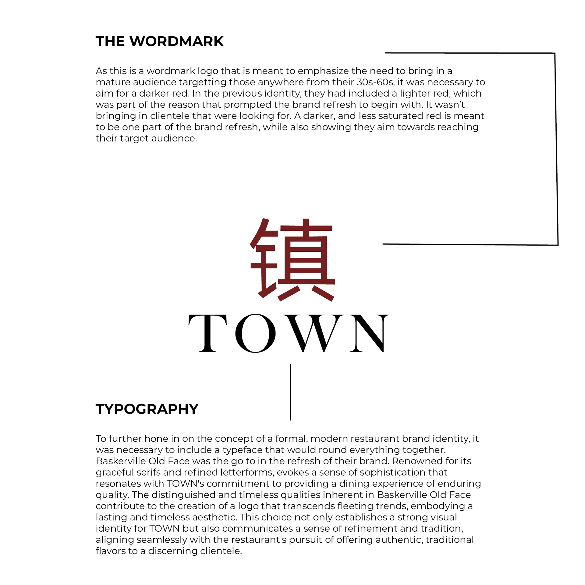
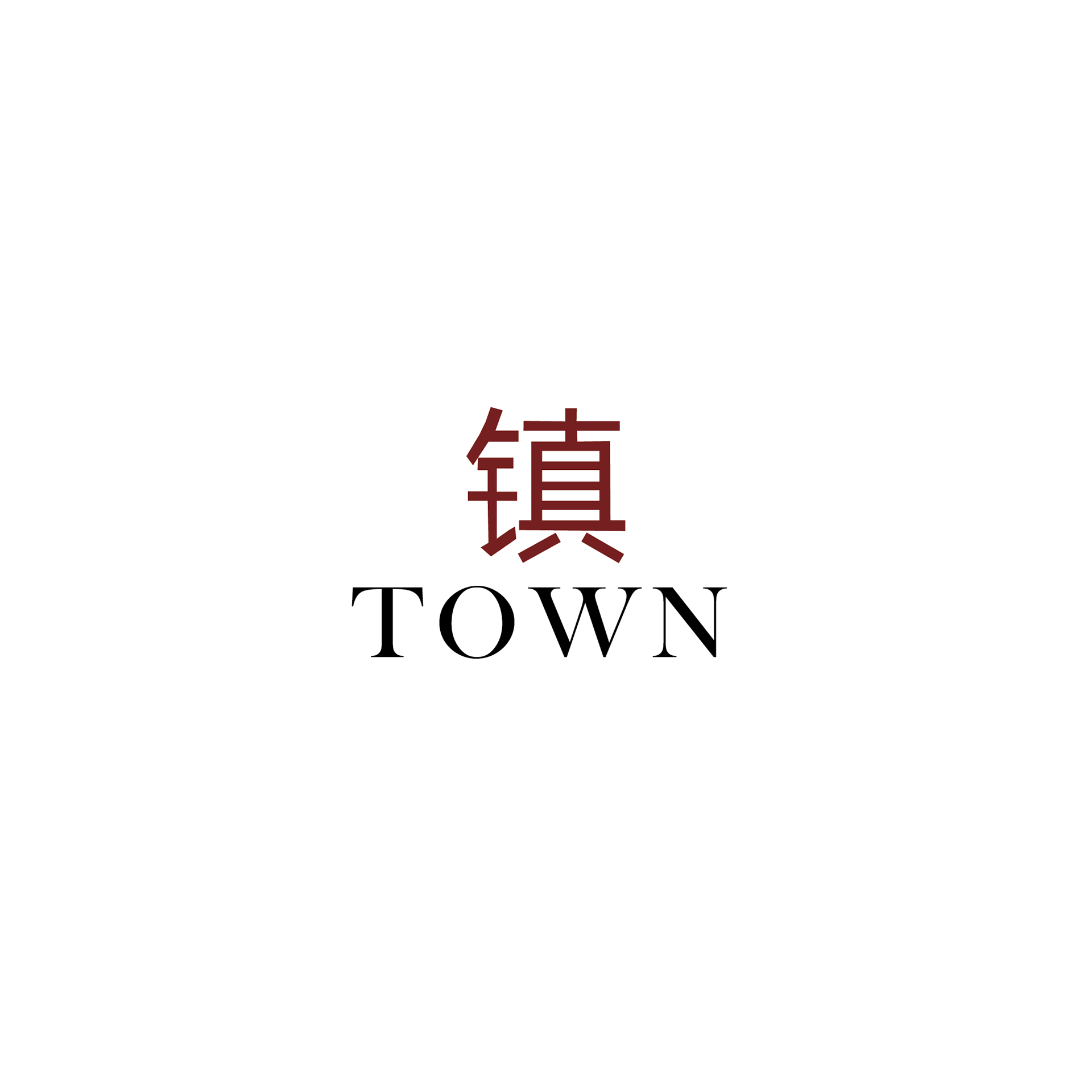
In terms of the design process, such as typography and color palette, the restaurant's visual identity utilized the Serif typeface Baskerville. It strikes a balance between tradition and modernity. It communicates a timeless elegance, ensuring readability while resonating with the refined tastes of the target demographic. In items including their menu, Garamond was chosen for the body text. Garamond's classic and elegant appearance complements Baskerville well. Its letterforms make it a suitable choice for menu layouts and table tents, maintaining a cohesive and sophisticated aesthetic.
This is all complimented by the primary color palette utilizing a dark red. Not only does the dark red exude warmth, but it is generally associated with the cultural richness with traditional Chinese aesthetics. Their secondary color palette utilizing gold in the logomark adds a touch of luxury to the overall visual scheme. The use of these colors not only aligns with cultural symbolism but also creates a cohesive and inviting ambiance within the restaurant, essential for attracting and retaining patrons within the 30 to 60 age range.

MISSION STATEMENT AND VALUES
TOWN's mission, or their mission statement is to "Transcend the ordinary dining experience by offering a harmonious blend of authenticity, traditional flavors, and a welcoming ambiance." These same values are shown within their mission statement. They care about their clientele, and only want a pleasant experience for them, each and every time.
TOWN's commitment to authenticity signifies a dedication to providing a genuine representation of Chinese culinary traditions. This extends beyond the menu to encompass the overall dining atmosphere, decor, and cultural nuances. Highlighting specific culinary techniques, regional specialties, or even sourcing ingredients directly from China reinforces the authenticity of the dining experience. The emphasis on traditional flavors implies a meticulous curation of the menu to showcase time-honored recipes and culinary techniques. This could involve a focus on classic dishes with a modern twist or the inclusion of regional specialties that capture the diverse and rich tapestry of Chinese cuisine. Communicating the stories behind these flavors and the cultural significance of each dish can deepen the connection between the patrons and the dining experience.
TOWN aims to create not just a restaurant but a warm and inviting space where patrons feel a sense of belonging. This could involve attentive service, comfortable seating arrangements conducive to socializing, and an overall atmosphere that fosters relaxation and enjoyment. In essence, TOWN's mission goes beyond serving meals; it strives to curate an immersive and culturally enriching dining journey. By emphasizing authenticity, traditional flavors, and a welcoming ambiance, TOWN aims to create a space where patrons can not only savor exceptional Chinese cuisine but also forge lasting memories and connections with the culinary heritage they experience.
ISSUES ENCOUNTERED
Problem: TOWN, recognizing the necessity for a brand refresh, approached the redesign with a delicate balance between evolution and preservation. Acknowledging the significance of their existing brand, which held a sense of familiarity for patrons, the decision was made to embark on a transformation that respected the establishment's heritage. The objective was not to discard the past but to seamlessly integrate elements of tradition into a modernized visual identity. The focal question when redesigning the brand identity as a whole was:
"How will this rebranding influence their position as a restaurant? What elements were working with their previous branding, and what were not working?"
This question came from analyzing a sample size of 50 people who had previously went to the restaurant and had given their input towards what they had found both positive and negative in their experience in visiting the restaurant. While they had found the experience within the restaurant itself to be pleasant with a solid atmosphere overall, they had found that the brand didn't feel sophisticated enough and simply didn't resonate with their values as a restaurant. As soon as someone walks into the establishment, they are given a sense of what to expect, those feelings of ambiance. Even though the interior of the place did that, it didn't match that same feeling the logo did, their collateral or print materials (Menu, table tent, etc.) did.
Solution: TOWN recognized the need for a rebrand to stay relevant in the culinary landscape. The outdated brand no longer resonated with the evolving preferences of their clientele, necessitating a visual transformation to better align with contemporary aesthetics. It was clear that the typography utilized was the first thing that needed to be changed, along with the logo as a whole.
Their previous identity was to say the least not very flexible. It was not capable of reaching their ideal target audience, being the aforementioned clientele between the ages of 30-60 years old. Everything from the previous typography utilized to how much negative space there was, even down to the choices within their color palette. Their logo felt too rigid to say the least, and their color palette wasn't very effective as communicating their values.